CSS Layouts
Creating modern web page layouts usually takes a couple of patterns.

Each part of the page can be split into separate visual boxes that need to be created inside the HTML. These boxes will take up certain space or be positioned according to CSS display and/or position.
The first task of creating a layout is to decide what boxes the layout is composed of.

Let's look at a couple of CSS techniques that you can use to create common web layouts:
Fixed Width Layout
Explicitly set the width of the main part of the site to, for example, 800px.
Set the margins to this div to auto to center it on the page.
Variable Count Card Row

Card layouts use fixed pixel width cards to arrange a number of the across the width of the screen.
Fixed width and display:inline-block makes the cards take up a variable number per row.
.card{
  display:inline-block;
  width:100px;
}
Card with position relative - absolute
Cards with visual elements inside can be absolutely positioned when the width is fixed.
.card-button{
  position:absolute;
  top: 3px;
  right: 3px;
  width:10px;
  height:10px;
}

.card{
  position:relative;
  ...
Float Column Layout
One way to make a column layout is floats. This is an old technique that is being replaced by newer layout techniques built into modern browsers. (i.e., flexbox)
Column widths use percentages to split up inline-block divs into equal (or offset to predetermined dinmension) columns.
display:inlne-block makes the divs sit next to each other.
In this example we set a proportional width so that we can have 2 columns that are equal width.
In this layout the text will flow to whatever height it wants.
We also set float on the columns so that they stick together.
We need the clear to make sure there are no other elements that are affected.
<div class="column-container">
  <div class="column">stuff</div>
  <div class="column">stuff</div>
</div>
.column{
  display:inline-block;
  width:50%;
  background-color:pink;
  box-sizing:border-box;
  float:left;
  padding:10px;
}

.column-container:after{
  display: table;
  clear: both;
  content: '';
}
Border Box
In order to have the layout boxes be exactly 50%, you can also set the box-sizing property to border-box.
This means that you are specifying the final width of the box, including the margins.
For more details see here: https://developer.mozilla.org/en-US/docs/Web/CSS/box-sizing
Box Model For Layouts
One problem people consisteintly run into is the fact that percentage box widths for layout DO NOT take into account margin or padding.
A div that has 50% width and also 20px of left and right margin will end up being 50% width PLUS 40px of width to account for the margins. One approach is to also make the margins and padding of those divs percentage measurements.
Another thing to note is that you can't (and shouldn't) set any heights as percentages. The box model doesn't really take percentage heights.
Pairing Exercise
Create a web layout.
Make up a page to create.
Some suggestions:
- a pizza restaurant
- a hair salon
- a dentist office
or you can just use lorem ipsum
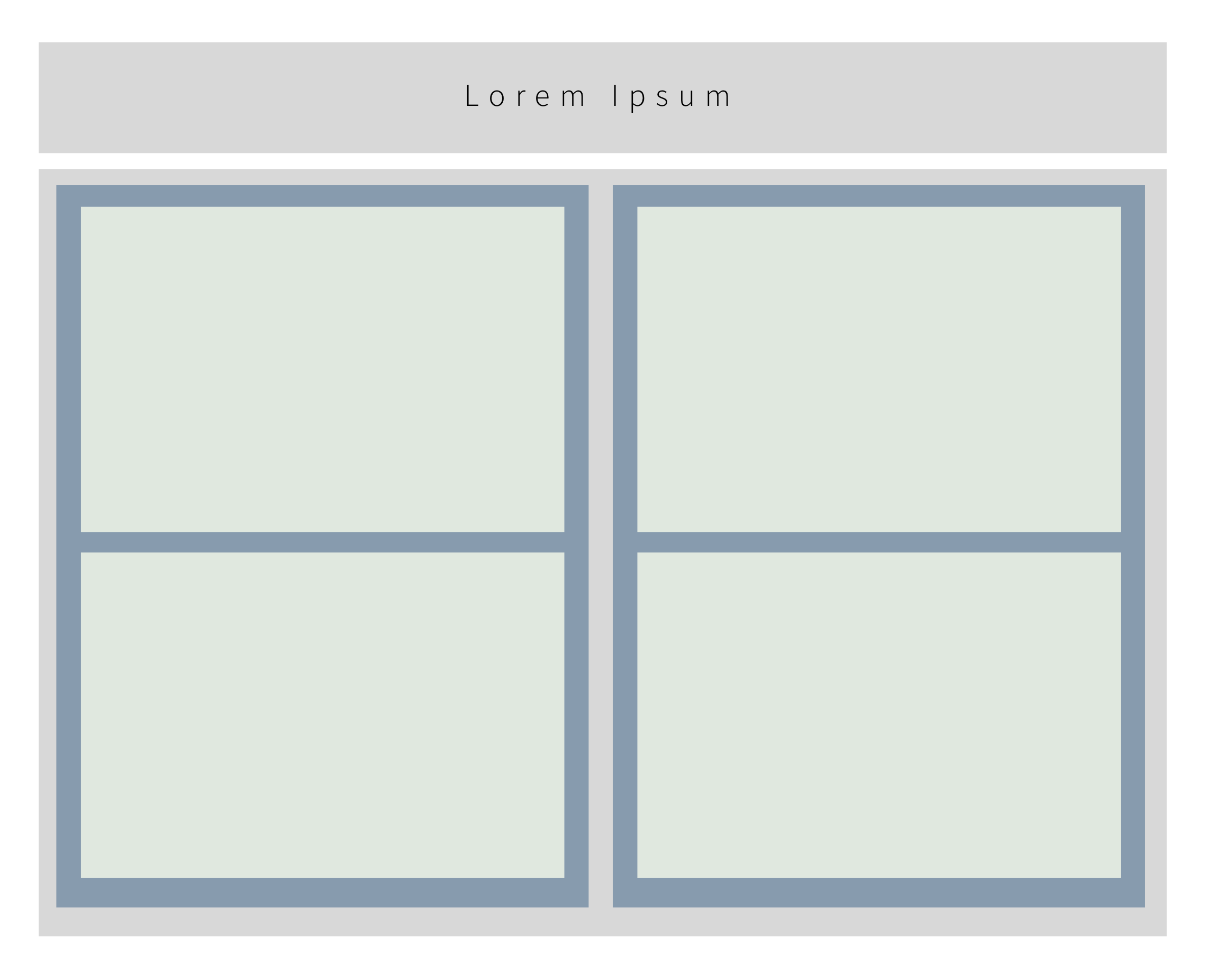
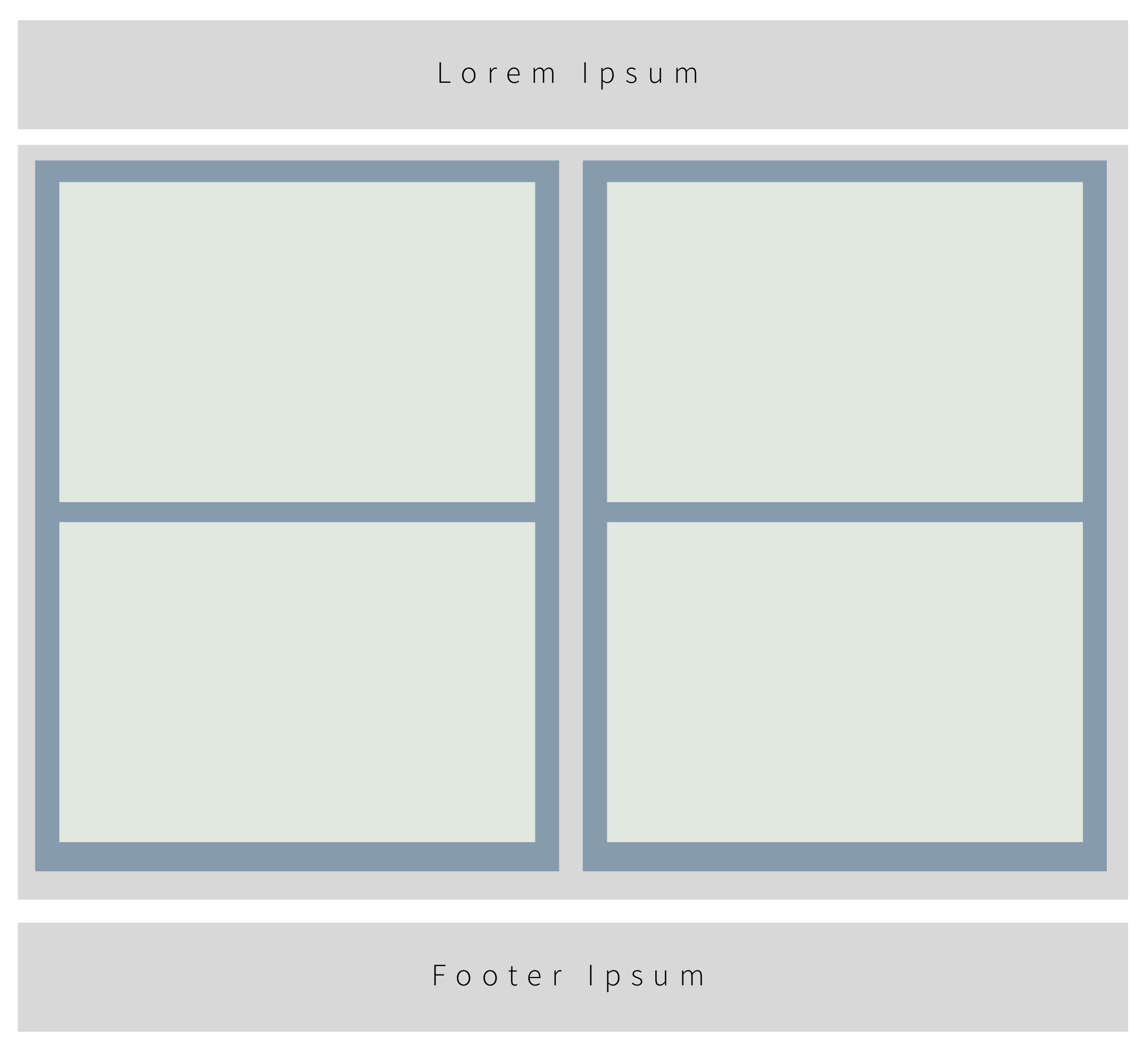
Create a 2 column floated layout using percentage widths.
Note that this example is only the structure of the divs - it does not show the exact measurements of the elements of the design.

Add a header.

Add a footer.

In one column create 2 or more cards that have a title and some text in them.
Use position absolute/relative to put this smiley emoji in the upper right corner of the card. https://github.com/wdi-sg/gitbook-2018/blob/master/images/smile.png?raw=true
Create new content for a 3 column layout.